Graphic Design Projects
Lane Community College Annual Pow-wow Poster and T-Shirt Designs
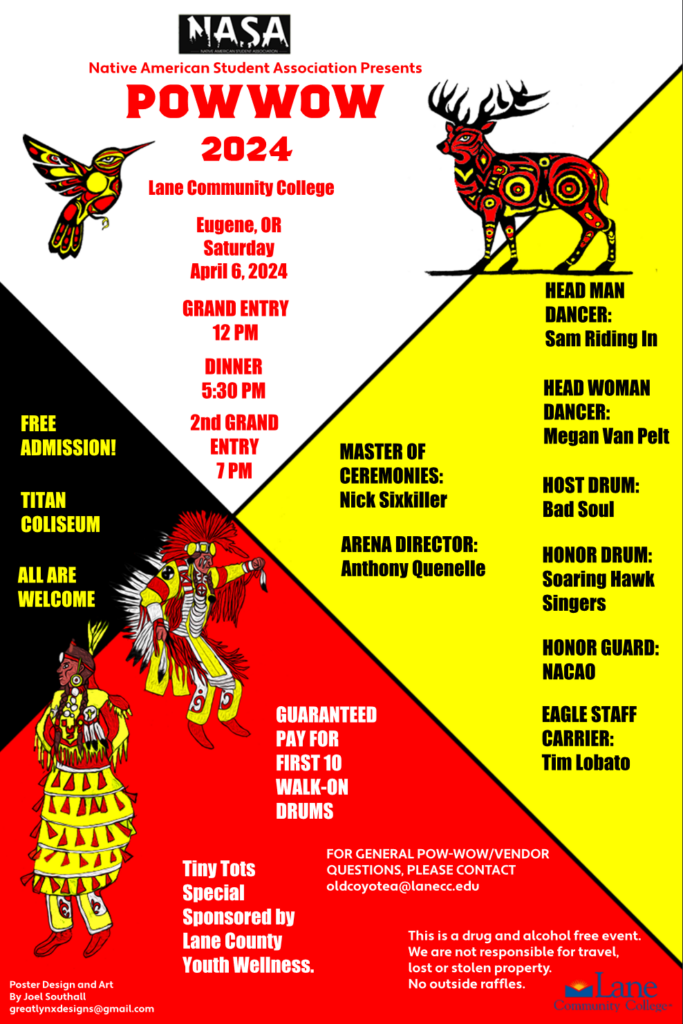
2024 Pow-wow 11 by 17 Poster Design for Lane Community College Native American Student Association
Goal: To succinctly capture the essence of a Pow-wow while creating an engaging and modern aesthetic.
Tools Used: Adobe Photoshop, Adobe Illustrator.
Design Inspiration: Minimalist aesthetic influenced by Bauhaus principles and the four directions of the medicine wheel.
Core Visual Element:
Focused on the symbol of the four directions (north, south, east, west), offset for visual balance.
Process:
Hand-drew four illustrative graphic elements in pencil and ink.
Scanned drawings and refined them digitally with Photoshop and Illustrator.
Enhanced with complex line art and vibrant colors for a dynamic visual experience.
Layout and Composition:
Entire layout organization and all graphic elements were conceptualized and created by me. Used zoomed in perspective of medicine wheel and positioned it slightly off center to enhance visual interest.
Additional Deliverables:
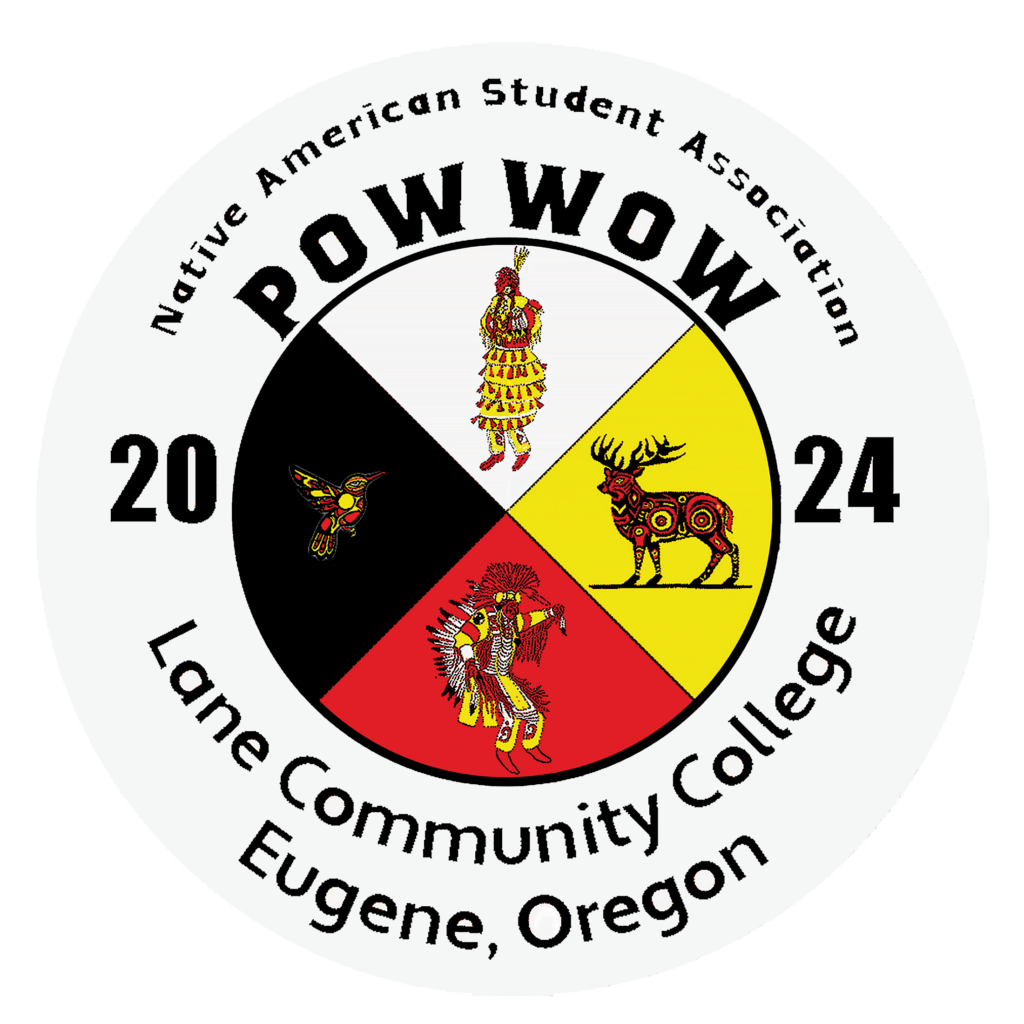
T-shirts were printed in a variety of colors by local artist and printer Rowena Jackson.
Adapted the four illustrative graphics against the medicine wheel.
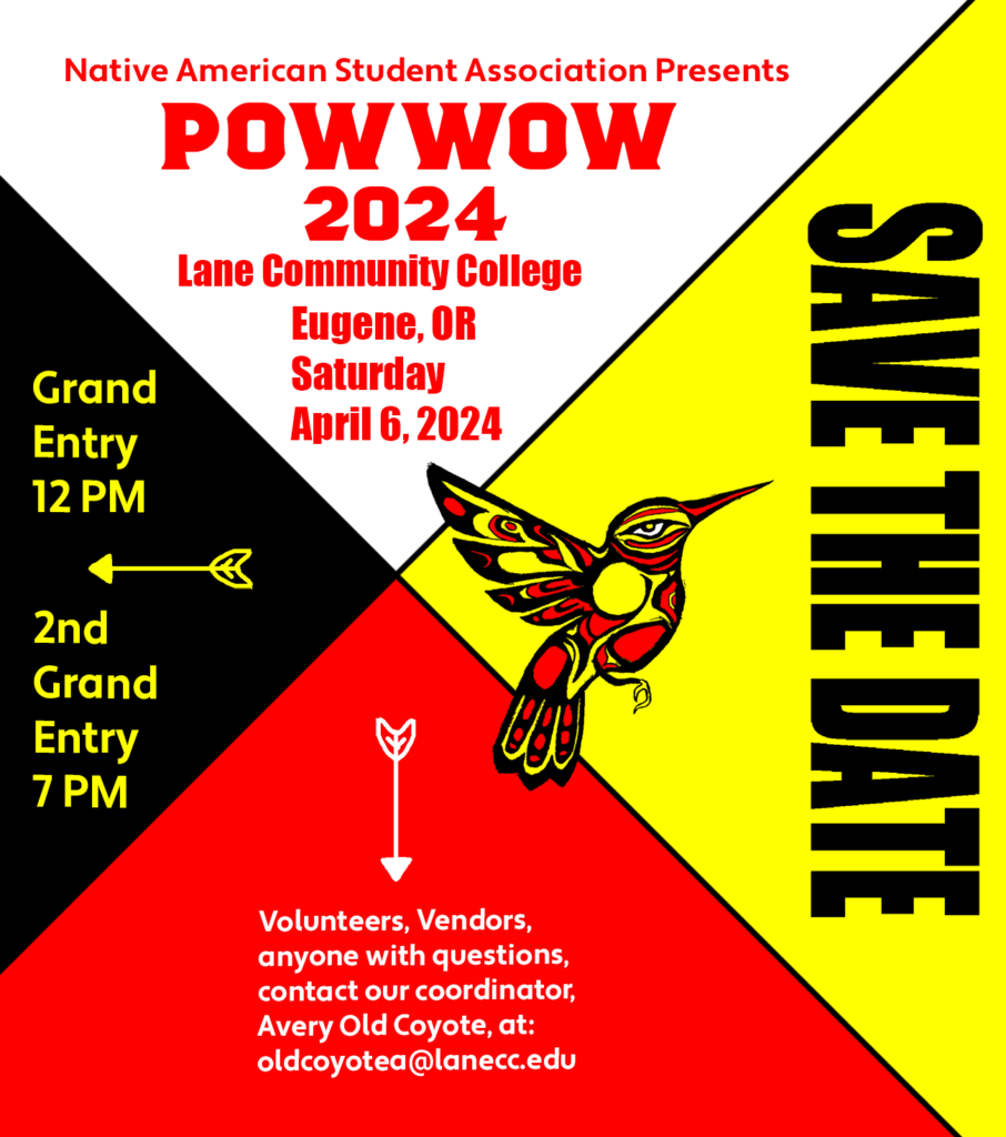
Save the Date flier delivered in electronic and print to build excitement and inform about the upcoming Pow-wow.
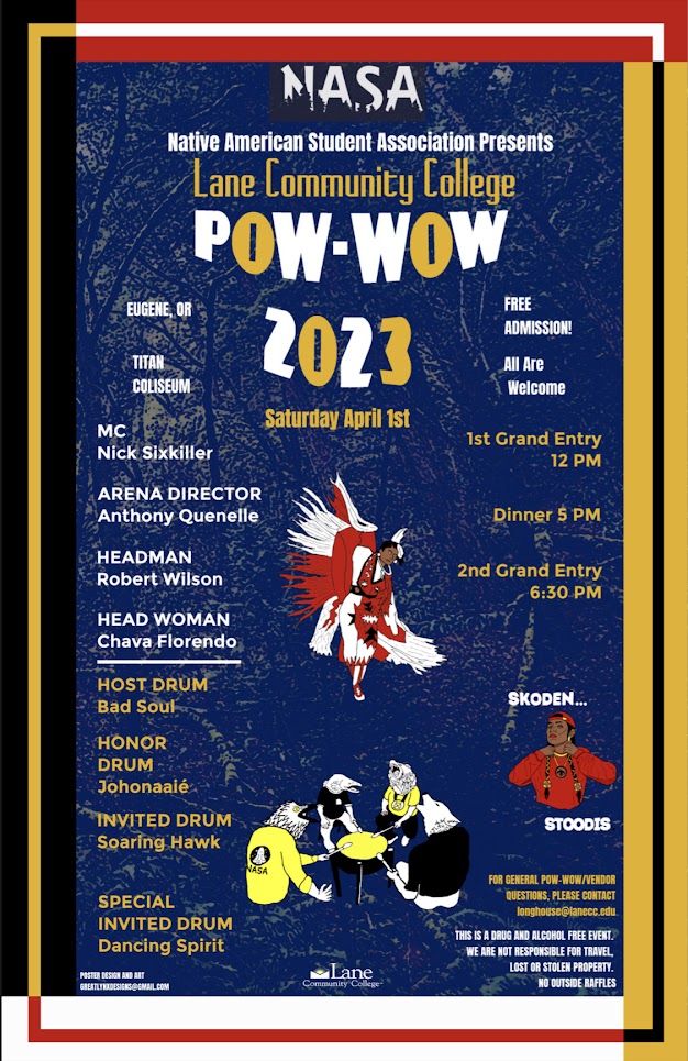
2023 Lane County Pow-Wow 11 by 17 Poster Design
Extra Work: Included some unused sketches created during the design process to showcase additional concepts.
Tools Used: GIMP, with color schemes incorporating LCC’s official Pantone colors:
Pantone 287 Blue for the background overlay.
Pantone 130 Gold for font accents.
Design Inspiration: Colors and symbolism drawn from the Native American Medicine Wheel (Four Directions) as well as LCC’s official Pantone colors.
Process:
Created individual illustrations as pencil sketches.
Inked and scanned the sketches into a digital format.
Colored and edited the illustrations digitally, integrating them into the poster.
Additional Deliverables:
Designed a flier for promotional use.
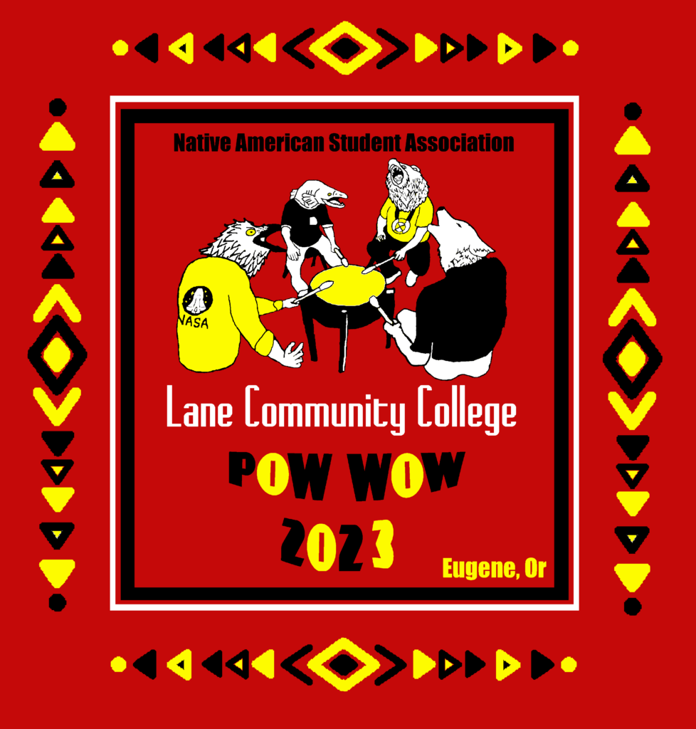
Created a t-shirt design used on two different shirt colors.
Additional Deliverables:
T-shirts featuring this design were printed in a variety of colors by local artist and printer Rowena Jackson.
Used the four animal headed drummers graphic for the T-shirt design.
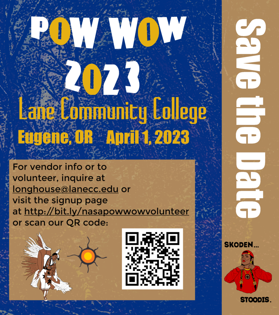
Save the Date flier delivered in electronic and print to build excitement and inform about the upcoming Pow-wow.
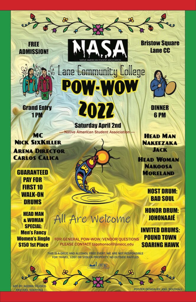
2022 Lane County Pow-Wow 11 by 17 Poster Design
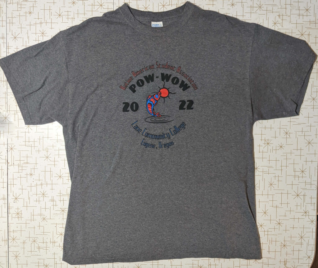
Adapted the salmon fish illustration for T-shirt designs sold at the Pow-wow.
Tools Used: Adobe Photoshop.
Design Inspiration: Spring theme featuring daffodils as the background, heavily modified in Photoshop.
Collaborative Work:
Integrated illustrated assets by another graphic designer, Neebin Studios.
Created my own illustrated asset: a leaping salmon fish at the center of the poster.
The sun graphic behind the fish was designed by Neebin Studios.
Additional Deliverables:
T-shirts were printed in two versions (yellow and grey) by local artist and printer Rowena Jackson.
Adapted the salmon fish illustration for T-shirt designs sold at the Pow-wow.
ALBUM ART PROJECT –2022
Two-Spirit Musician Duo Album Art Project
- Concept:
- Created album art for a two-person music group, each model portraying a different rapper/musician.
- The theme centered around Two-Spirit identity, reflecting a unique cultural and artistic perspective.
- Process:
- Conducted a photo shoot, capturing several hundred images.
- Selected the best photos to create the final design.
- Developed logos for musicians and original illustrations used.
- Tools Used:
- Adobe Photoshop and GIMP for editing and composition.
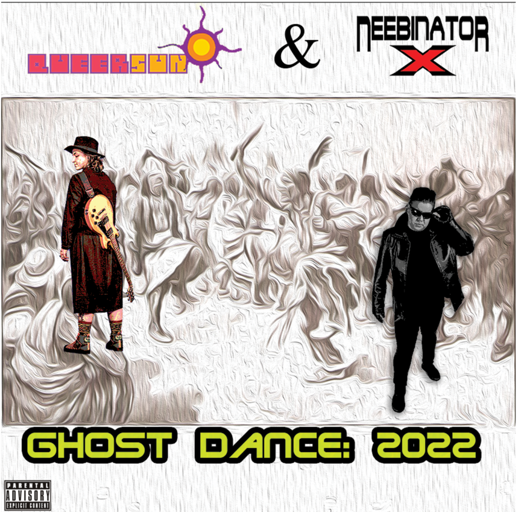
Album Cover Design – Two-Spirit Musician Duo
This design integrates traditional motifs with modern elements to evoke a sense of cultural resonance and individuality.
Background:
The cover features a heavily edited and altered free-to-use painting of the Ghost Dance, reimagined as a textured, ethereal background.
Grey figures from the original painting are blended into a birchbark-inspired white background, creating a layered, haunting visual theme.
Foreground Design:
The album title is prominently displayed, paired with the artists’ logos and names for bold branding.
Graphically altered photographs of the musicians are overlaid, posed to reflect their personas and bring focus to their identities.
Tools and Techniques:
Photoshop was utilized extensively to edit, blend, and manipulate the background and foreground elements, ensuring cohesion and impact.
Artistic Intent:
This design integrates traditional motifs with modern elements to evoke a sense of cultural resonance and individuality.
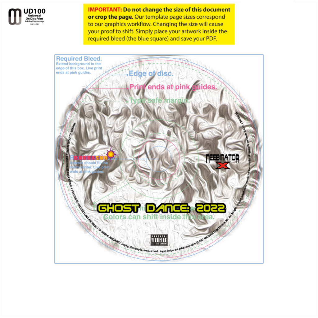
Album Case Artwork – Close-Up Detail
This close-up shot encapsulates the fusion of traditional inspiration and modern design, inviting viewers to connect with the cultural and personal narratives behind the music.
Design Focus:
A zoomed-in section of the reimagined Ghost Dance graphic serves as the centerpiece for the album case artwork.
The textured, ethereal background highlights the interplay of grey figures blending into the birchbark-inspired white tones, emphasizing depth and atmosphere.
Typography and Branding:
The album title is prominently displayed, maintaining clarity and visual impact against the intricate background.
Names and logos of the two musicians are featured, reinforcing the duo’s brand identity and connection to the album’s theme.
Artistic Intent:
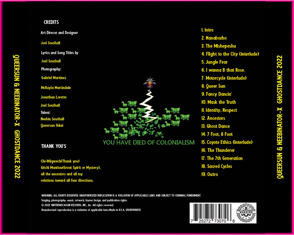
Tray Card – Back Cover Design
- Design Overview:
- The back cover features a numbered list of songs, meticulously arranged for clarity and ease of readability.
- At the center of the composition is a striking graphic:
- A Thunderbird unleashing a thunderbolt upon a group of wagons pulled by dinosaurs, evoking a sense of power and mythological grandeur.
- Typography and Theme:
- Below the graphic is bold text reading: “You have died of colonialism”.
- This phrase is a poignant and provocative nod to the classic Oregon Trail game, reinterpreted in a culturally resonant and subversive style.
- Artistic Intent:
- The juxtaposition of the mythical Thunderbird with dinosaurs and wagons combines humor, cultural critique, and creative storytelling.
- This design ties the album’s themes of resilience, cultural identity, and commentary on historical narratives into a single evocative image.
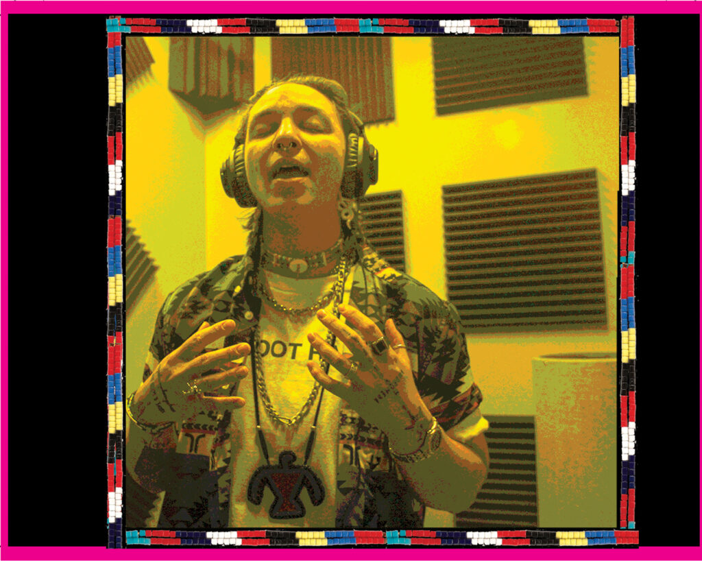
Tray Card (Inside) – Recording Booth Snapshot
The photograph is centered, ensuring it draws focus while harmonizing with the overall design aesthetic of the album’s visual elements.
Design Overview:
The inside tray card features an intimate and candid photograph of QueerSun, one of the album’s artists, captured mid-performance in the recording booth.
The image highlights QueerSun’s passion and authenticity, showcasing a behind-the-scenes moment from the album’s creation.
Artistic Intent:
This design choice provides a personal touch, allowing listeners to connect with the artist on a deeper level by witnessing a moment of artistic expression.
The raw energy of the recording booth complements the album’s themes of individuality and cultural resonance.
Album Panels Showcase
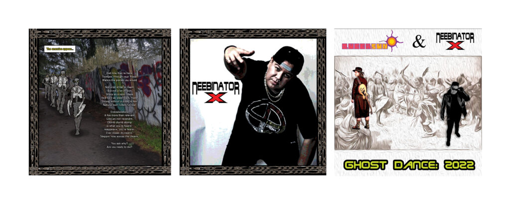
This panel ties the showcase together, grounding the viewer in the overarching visual theme of the album.
Panel 1: March of the Endoskeletons
Features a photo of an alleyway, transformed with striking illustrations of endoskeletons inspired by the Terminator franchise.
The artwork blends comic-style illustrations with the realism of the photograph, creating a gritty, dystopian aesthetic.
The endoskeletons are depicted marching ominously down the alley, evoking themes of resilience, rebellion, and futurism.
Panel 2: NeebinatorX in Action
Highlights a photograph of NeebinatorX, one of the album’s musicians, striking a signature rapper pose.
The image exudes confidence and individuality, tying into the artist’s persona and the album’s dynamic energy.
The composition focuses on NeebinatorX’s charisma, ensuring their presence resonates with fans.
Panel 3: Album Front Cover
Displays the front cover of the album, previously described, featuring the reimagined Ghost Dance graphic.
Album Panels Showcase – Part 2
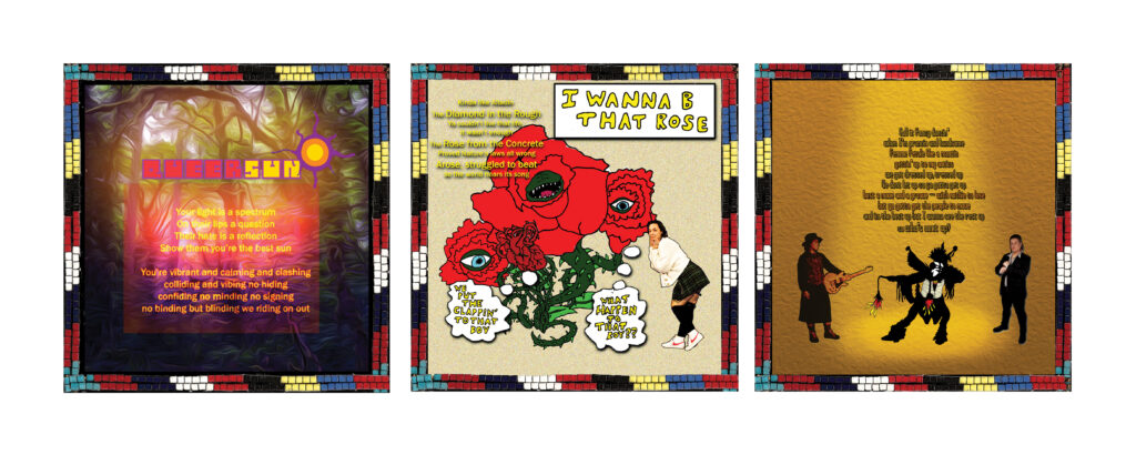
The dynamic composition reflects the album’s themes of cultural dialogue and artistic exploration.
Panel 1: Jungle Backdrop with Lyrics
Features QueerSun’s lyrics prominently displayed against a lush, textured jungled backdrop.
The vibrant setting complements the evocative and rhythmic nature of the lyrics, adding depth and atmosphere to the song’s themes.
Panel 2: “I Want to B That Rose”
Displays an illustration of a thorny, spiked vine monster with rose heads, inspired by the song title “I Want to B That Rose”.
QueerSun is depicted in a flirtatious pose next to the plant monster, blending humor and charisma.
The style continues the album’s comic illustration and realistic photography fusion, enhancing the playful yet edgy tone of the artwork.
Panel 3: Musical Showdown
Shows QueerSun holding a guitar, facing off against the Fancy Dancer illustration, while NeebinatorX poses confidently in a fancy suit on the opposite side.
The panel captures a symbolic and visual clash between traditional and modern styles, with each artist embodying their unique persona.
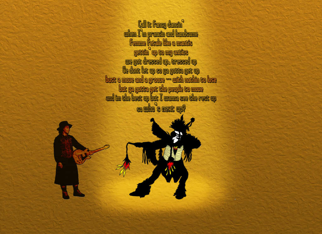
Booklet/Sleeve Artwork – “Fancy Dancer Face-Off”
It bridges tradition and modernity, evoking a sense of movement and connection through the visual and lyrical storytelling.
Design Elements:
Features an edited photograph of the artist QueerSun, posed with a commanding presence.
Opposite QueerSun is an illustration of a traditional Fancy Dancer, captured mid-motion in a dynamic stance.
The juxtaposition of the two figures symbolizes a dialogue between contemporary artistry and traditional cultural expressions.
Typography:
Above the artwork, lyrics about fancy dancing are prominently displayed, tying the visual elements to the thematic essence of the song.
The text is styled to complement the composition, ensuring readability without detracting from the artwork.
Artistic Intent:
The piece celebrates the vibrancy and significance of Fancy Dance culture while reflecting QueerSun’s personal and artistic identity.
OTHER PROJECTS
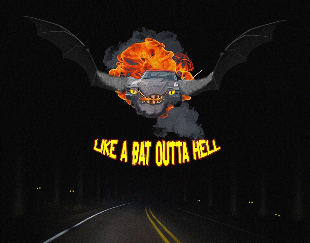
Digital Design Term Project
Amusing muscle car as dragon graphic created with Photoshop using free assets from a variety of sources
Image of Chevelle and driver photographed as directed by me
Rest of image modified in Adobe Photoshop
A variety of additional images used were sourced from free stock photos.
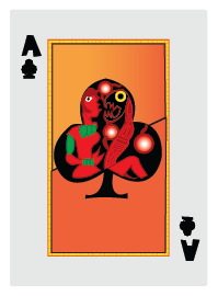
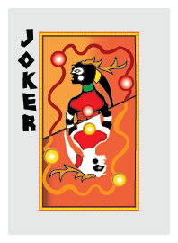
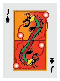
Northeastern Woodlands School-Styled Playing Cards
Project Overview:
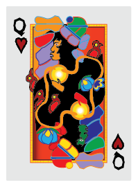
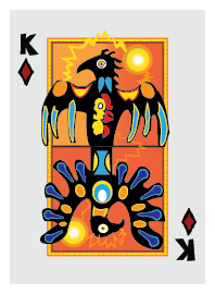
A deck of playing cards featuring original artwork inspired by the mythology and storytelling traditions of the Ojibwe people.
Designed with Adobe Illustrator.
Influenced by the art of Norval Morrisseau and the stories of Ojibwe storyteller Basil Johnson, among others.
Goal: To reflect the spirit of Ojibwe tales and beliefs through visual design.
Current Progress: Completed five proof-of-concept cards showcasing unique, original artwork.
Plans to expand the project into a full deck of playing cards.
Traditional Native American Salmon Bake – Digital Illustration Project
Overview:
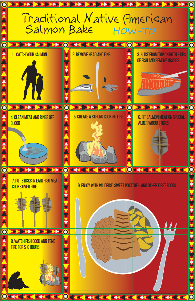
A visually engaging instructional design created for a Digital Illustration class, using Adobe Illustrator to document the process of a Traditional Native American Salmon Bake.
Key Features:
- Concept & Research:
- Inspired by observations of salmon bakes at the Lane Community College Pow-wow the past three years.
- Supplemented with research into traditional practices for cultural accuracy.
- Design Process:
- Created step-by-step visuals illustrating salmon preparation, fire pit setup, and cooking.
- Used bold vector graphics with earthy tones for clarity and authenticity.
- Educational Purpose:
- Designed to be both informative and visually appealing for cultural education and instructional use.
Skills Highlighted:
Ability to blend artistic skill with cultural storytelling and educational design.
Mastery of Adobe Illustrator for creating clean and precise vector illustrations.
Fish Lake Resort Logo – Web Design Project
Overview:
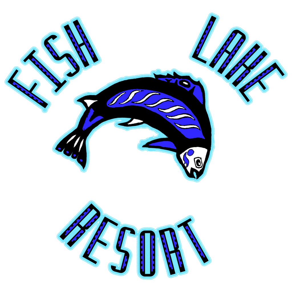
A logo created for a fictional Fish Lake Resort as part of a web design project. This design represents one of my early works in crafting Pacific Northwest Tribal-inspired illustrations, showcasing my ability to integrate cultural motifs into branding.
Key Features:
- Style:
- Inspired by Pacific Northwest Indigenous art, with bold lines and symbolic imagery.
- Purpose:
- Designed to represent the resort’s connection to nature and cultural heritage.
This project highlights my early exploration of integrating artistic and cultural elements into graphic design.
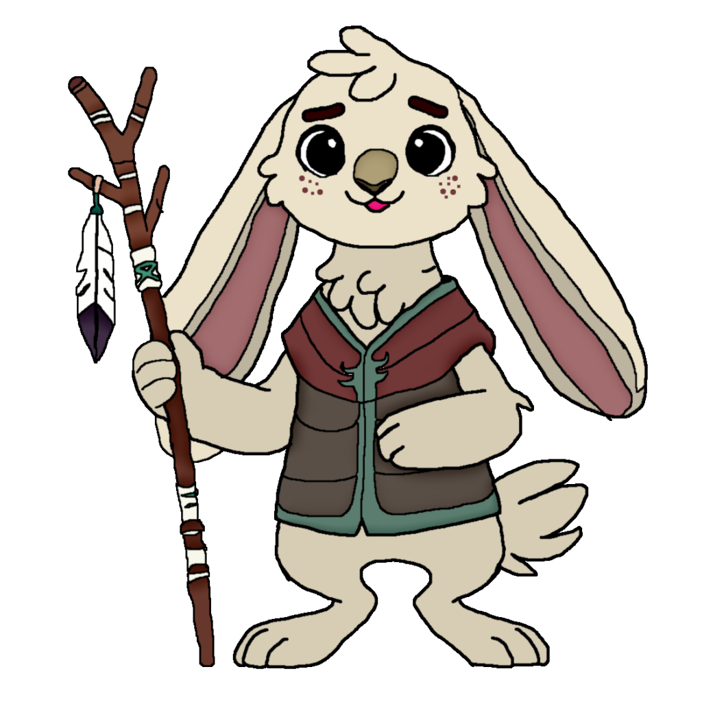
Hop with Wabooz Mascot for Language Learning App currently in development.
Sketched and designed with GIMP.
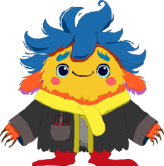
Cute monster created for ASP.NET voting game designed for Bitforest Let’s Vote 2024 game jam.
Sketched and designed with GIMP.
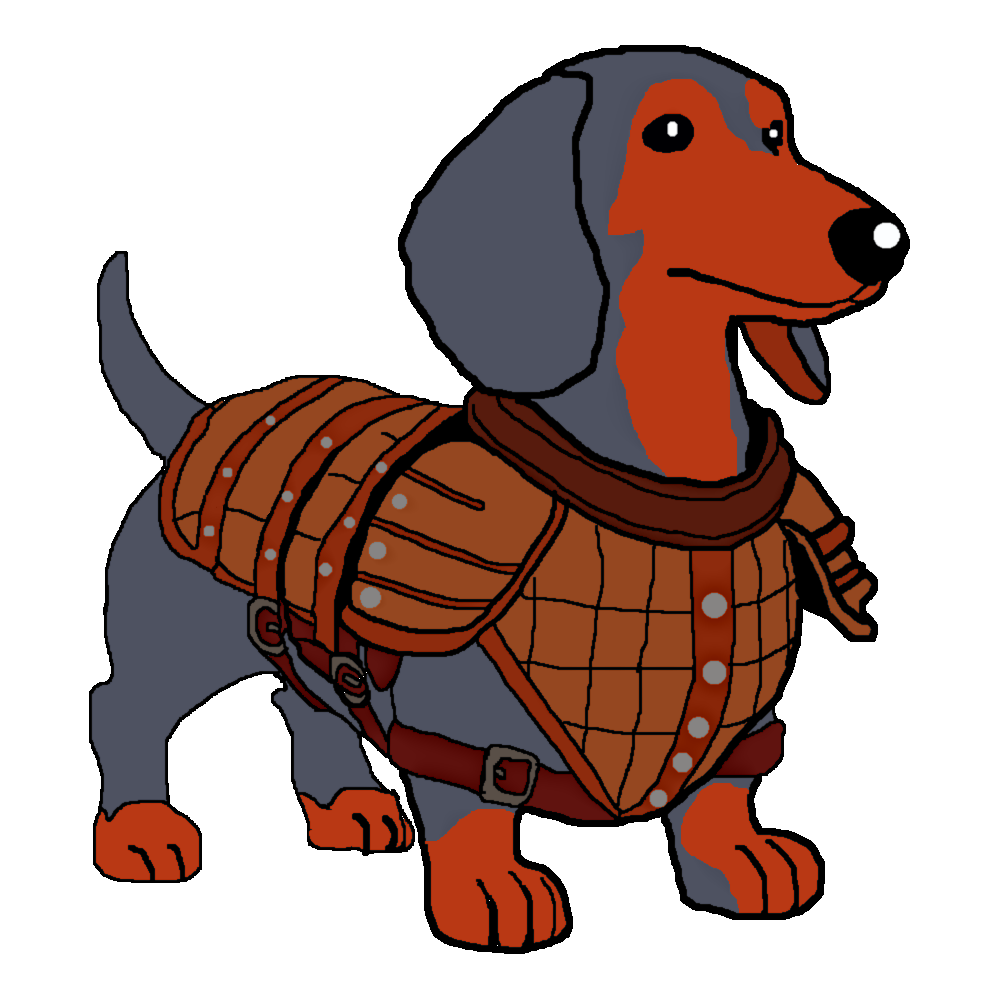
Sparky the Dungeon Dog, mascot for Jira-esque team organization tool currently in development.
Sketched and designed with GIMP.
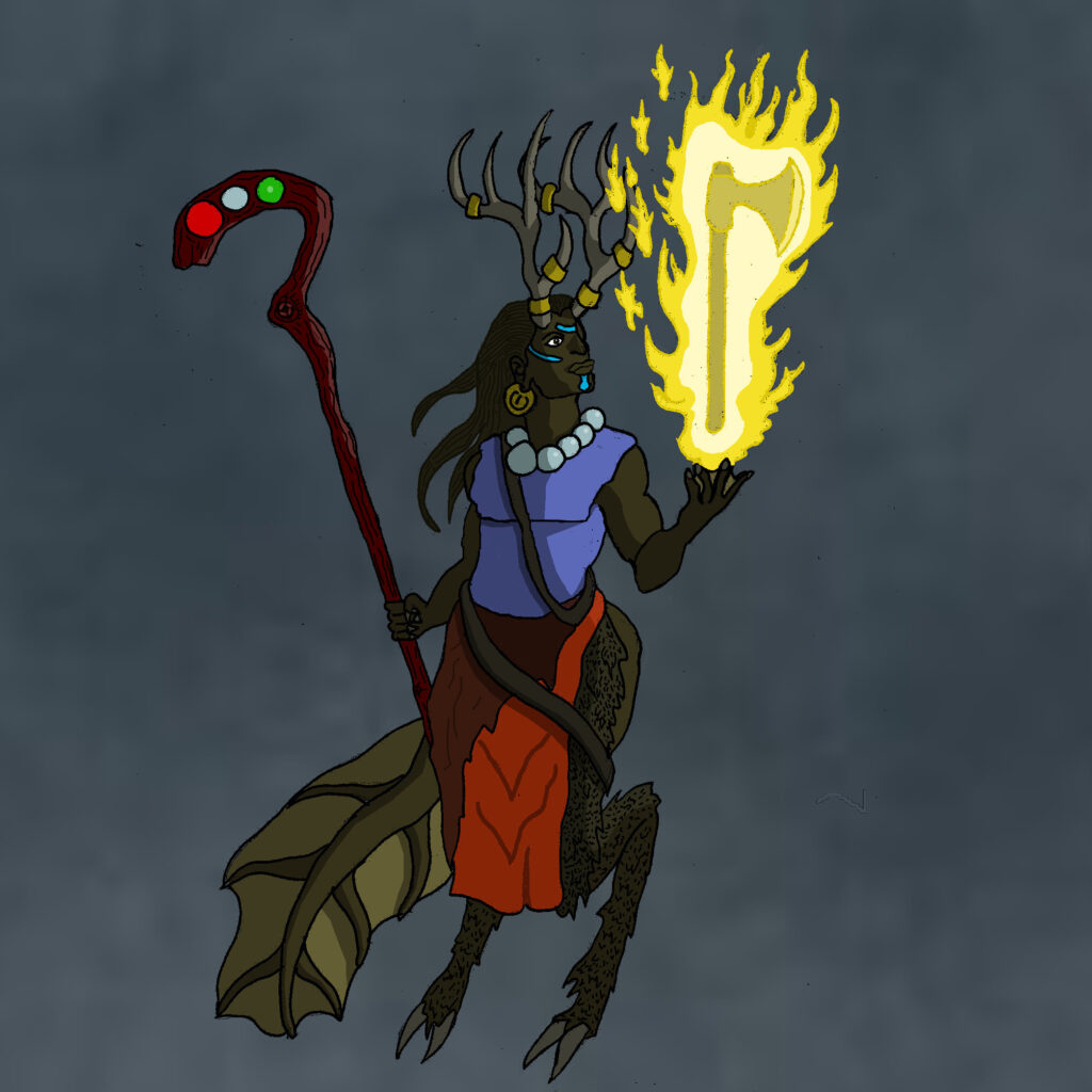
Original Fantasy character sketched by hand and digitally rendered with GIMP
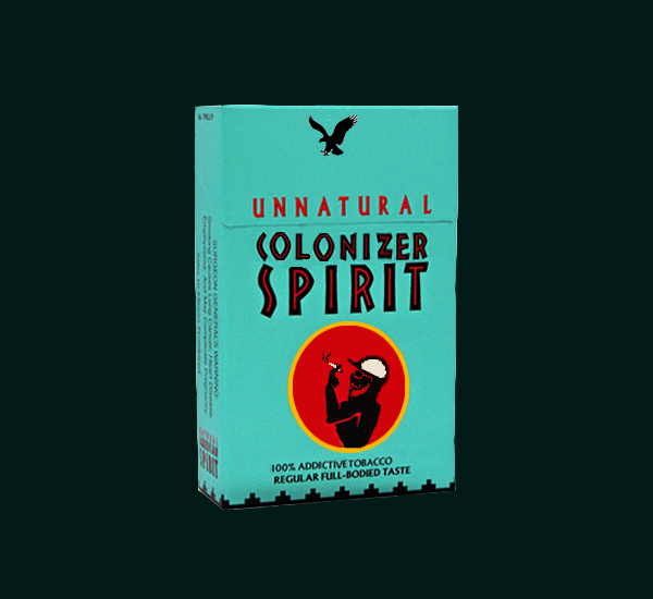
Culture remix project for a digital design course.
Tongue in cheek play on a popular cigarette brand.
